Beauty Blocks
| Client | Estetica |
| Program | Interior Refurbishment (Office/Training/Storage) |
| Area | 151 m² |
| Status | Completed |
| Photography | Jeremy San |
| Year of Completion | 2011 |
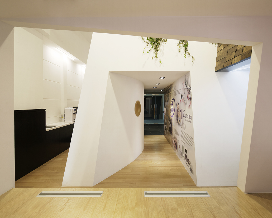
Ample pathways formed by different user-patterns shape 3 unique office volumes, creating a miniaturized city block experience.
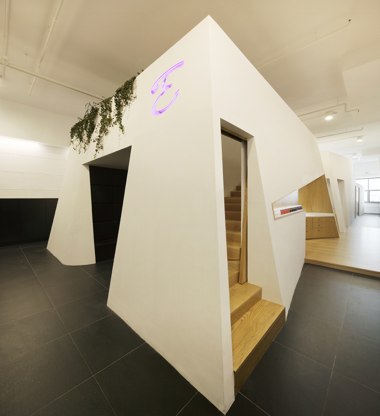
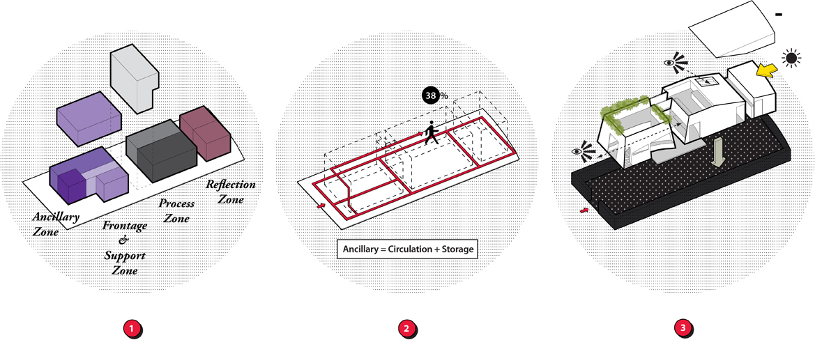
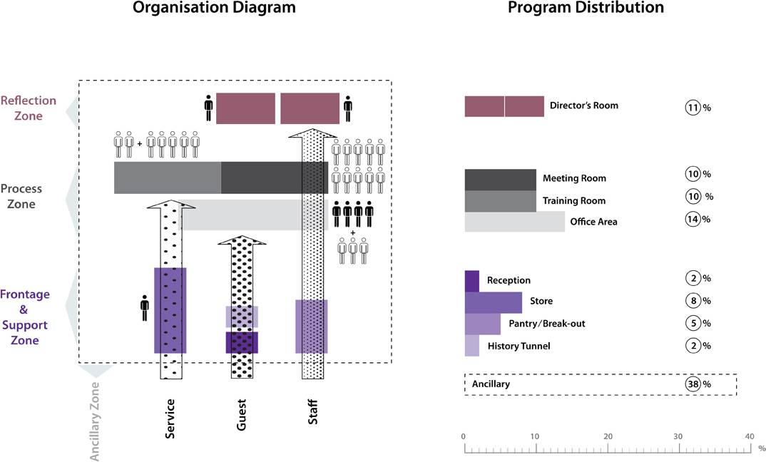
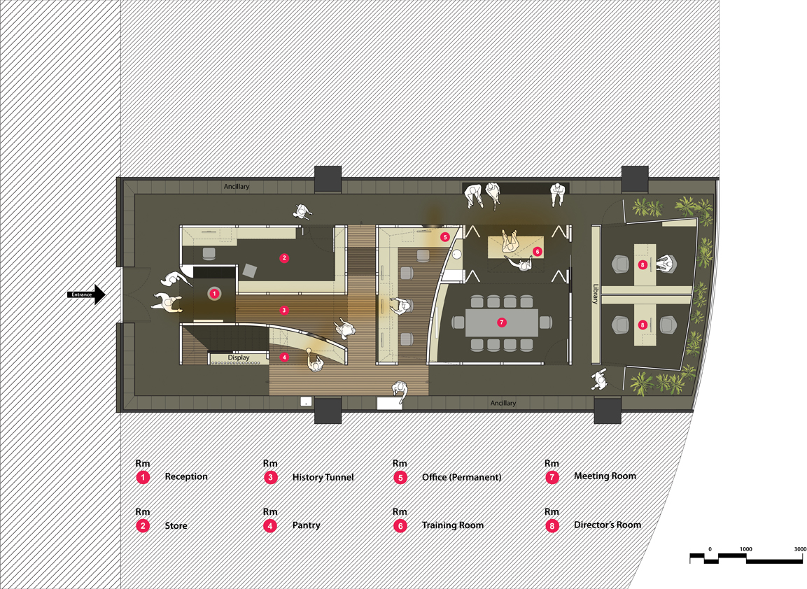
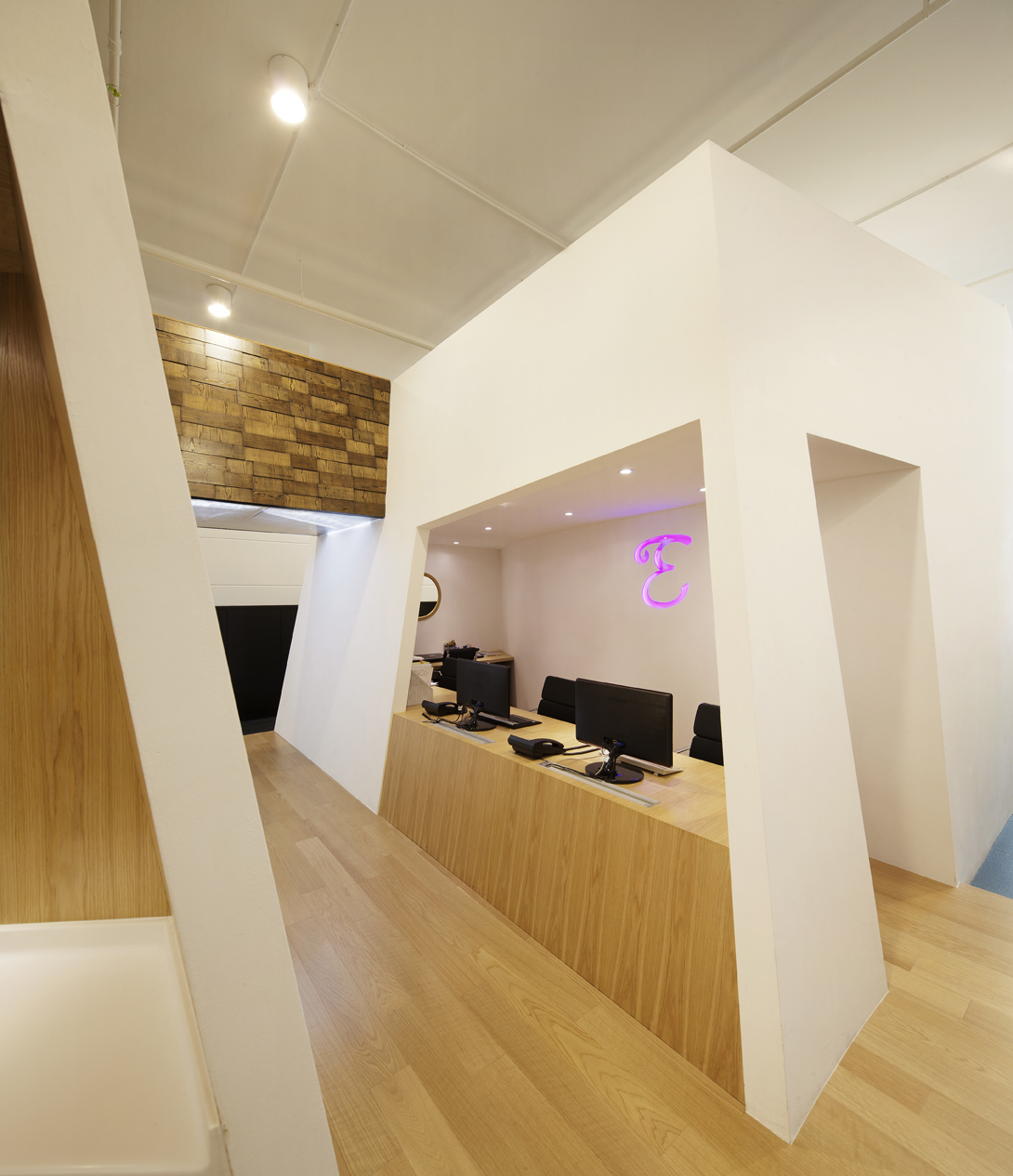
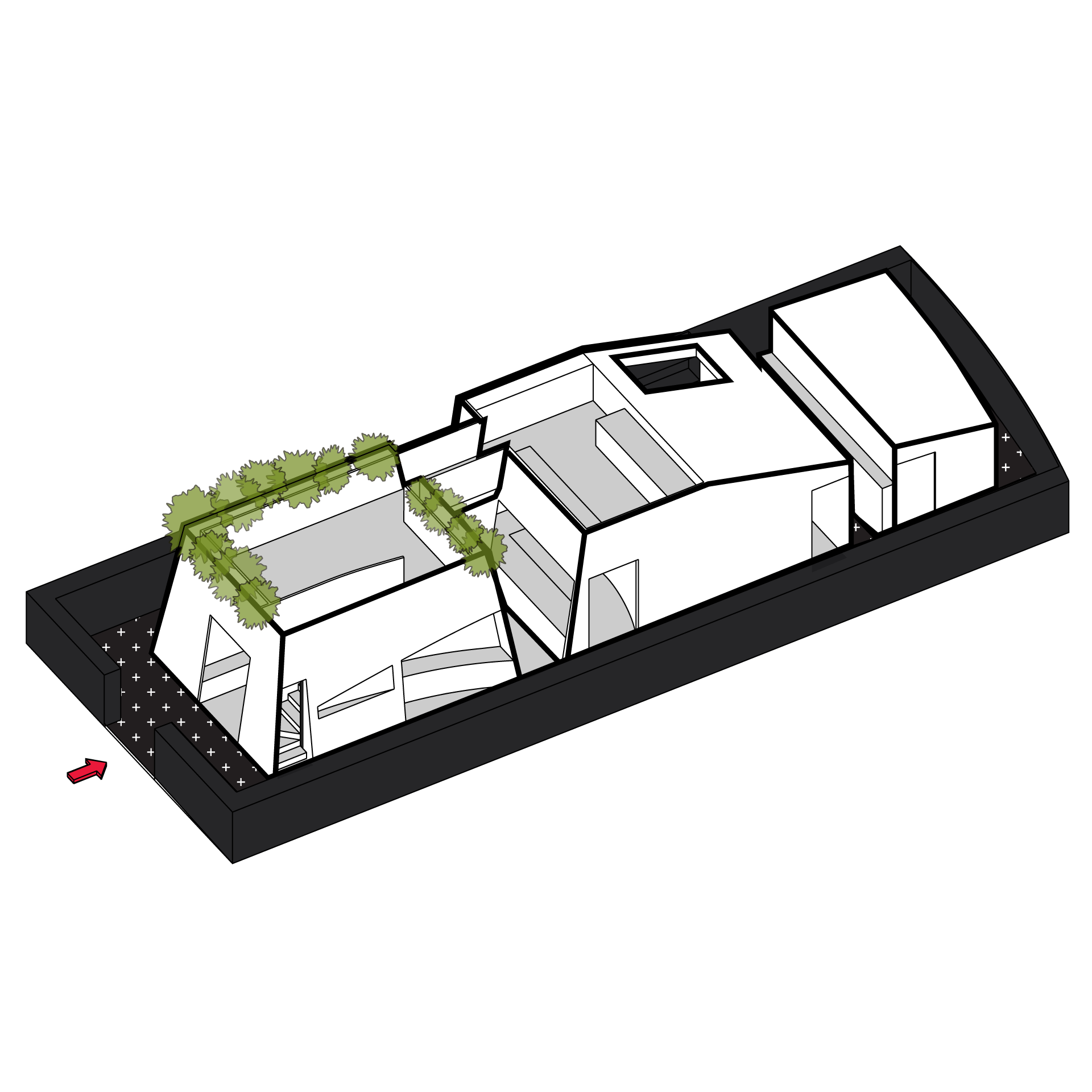
The new headquarters of a homegrown beauty enterprise in Singapore was designed to address its huge storage, specialist training, meeting and general office needs. This would serve as the main resource and support centre for their numerous customer outlets. The challenge for Studio SKLIM was to derive a spatial strategy that simultaneously dealt with the widely fluctuating human/product resources and yet maintain conducive environments for their training and everyday office operations. 3 user groups were identified, namely Service, Guest and Staff which had rather different user patterns and trajectories. Service staff transporting inventory on trolleys had direct same grade access to the store while guests were given an introductory tour of the company through video and pictorial displays. The relationship between the different user trajectories and their work zones was worked out by the placement of similar functions in adjacent to possible work groups. These main work zones are housed in 3 unique white volumes with ample circulation paths surrounding all sides.
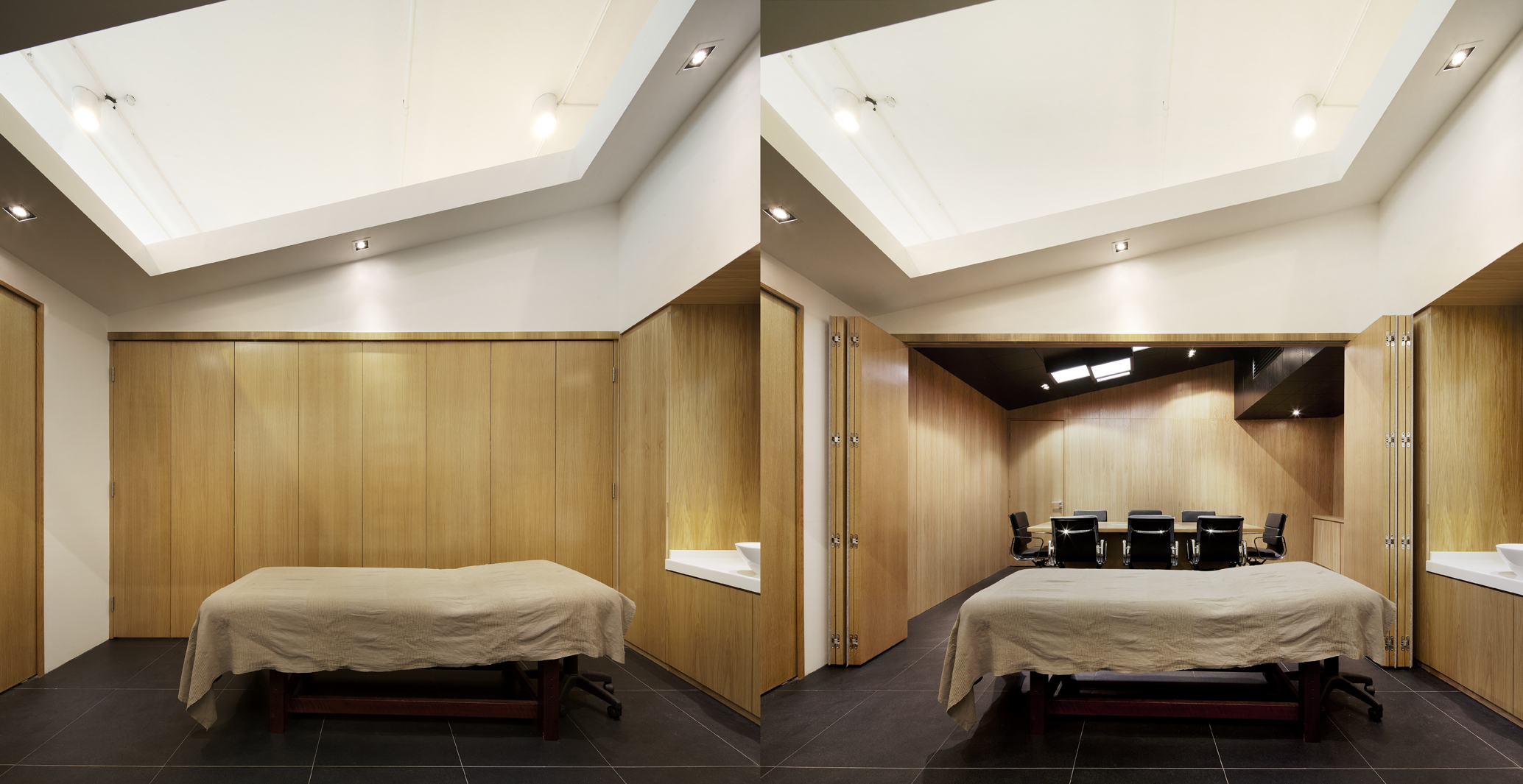
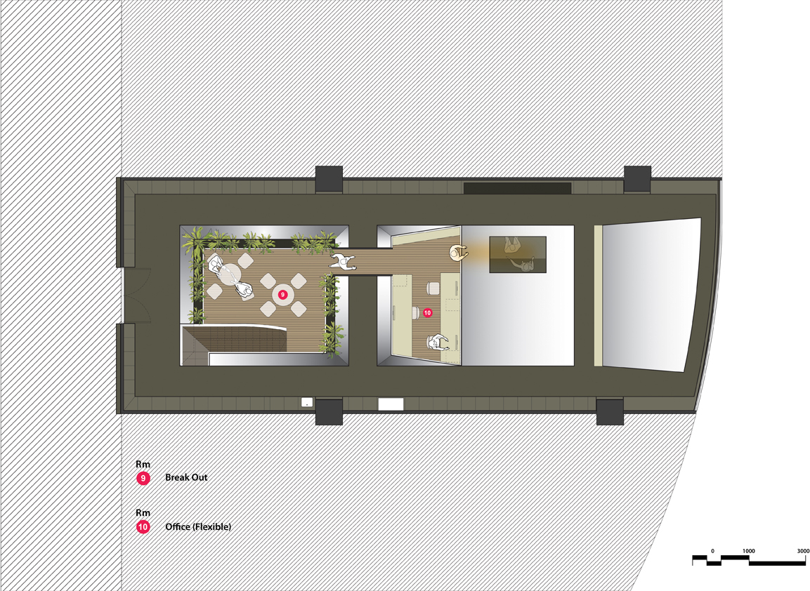
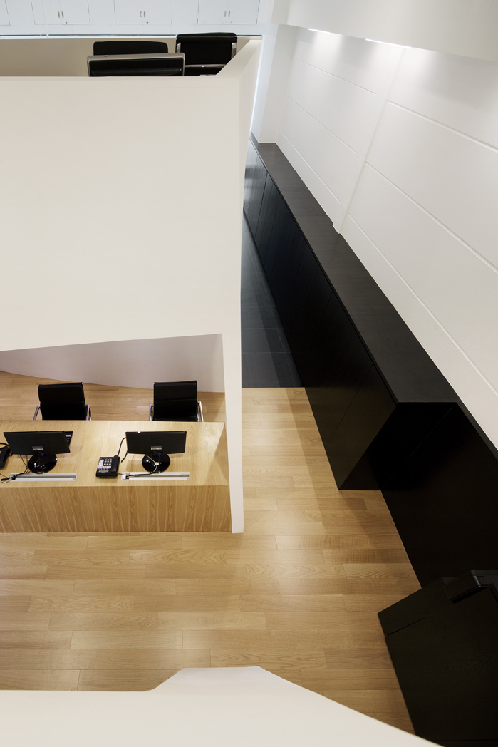
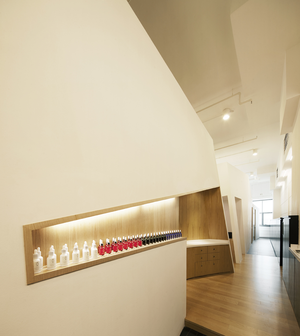
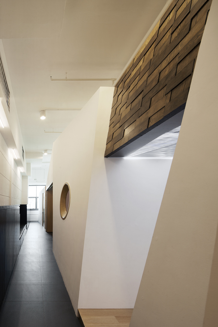
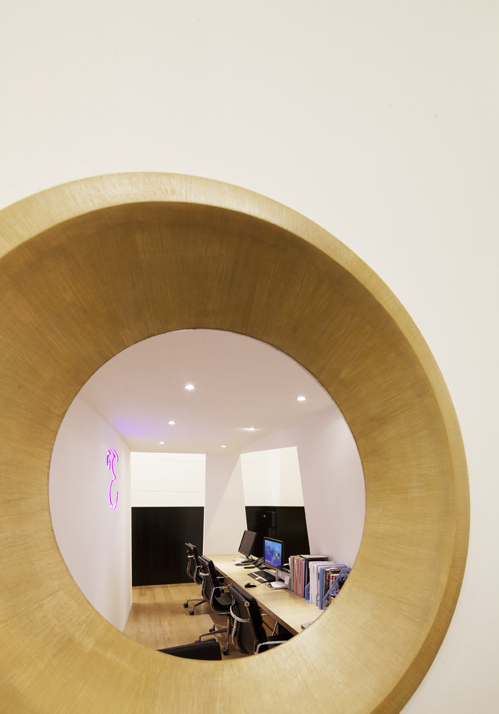
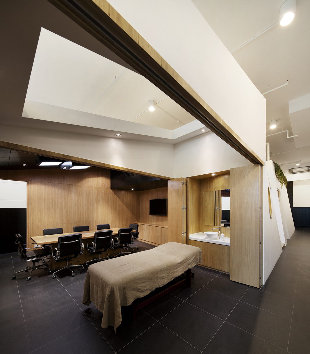
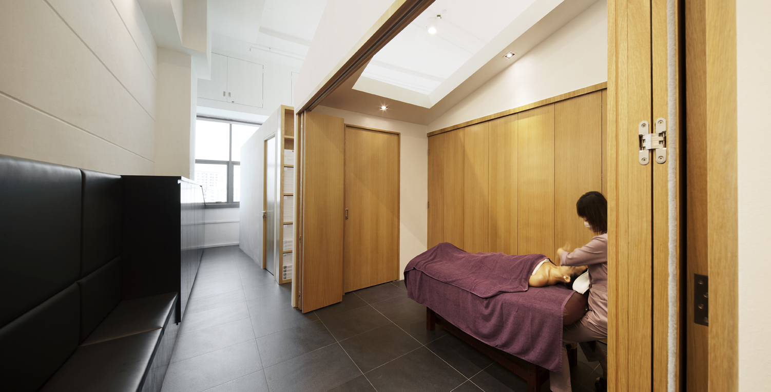
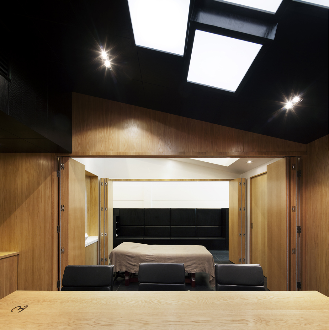
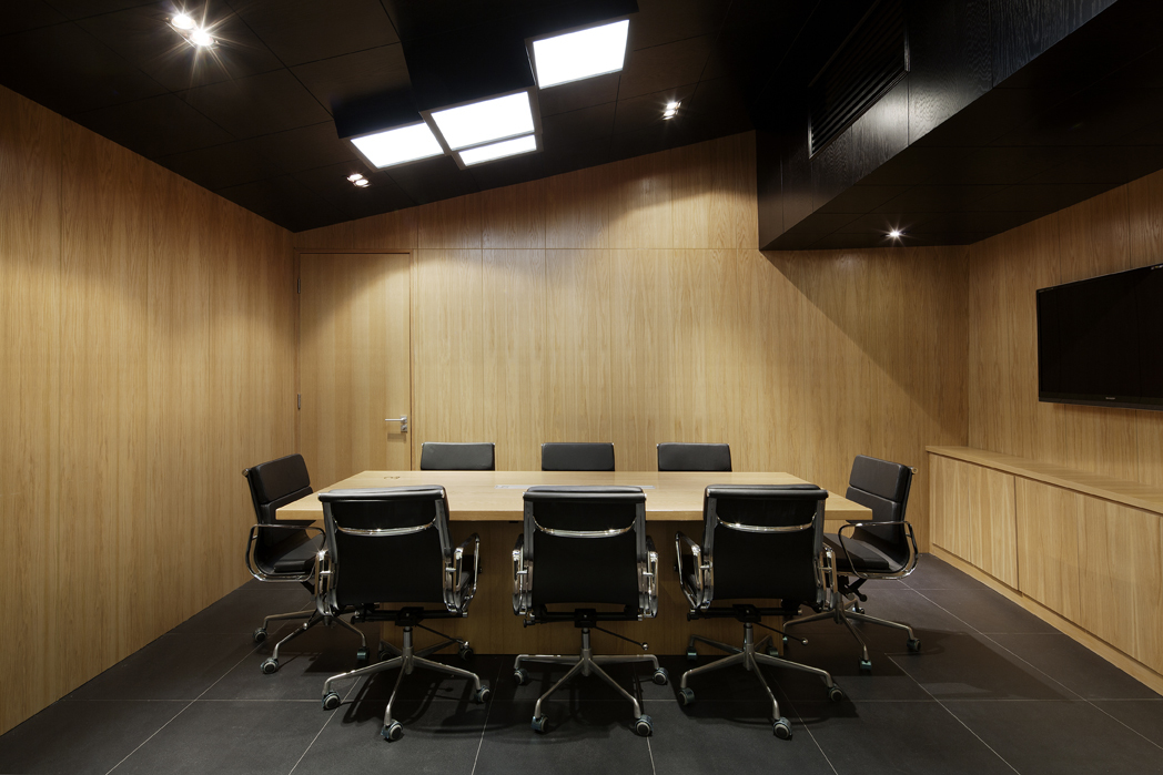
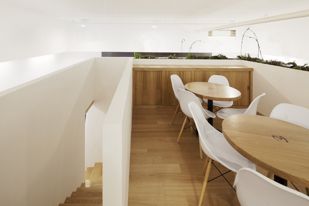
At first glance, with circulation and ancillary spaces occupying almost 38% of the floor area, this could hardly be seen as an efficient use of space. The black band of cabinets that flank the pathways has been differentiated according to the localized needs of each block facet. Besides, providing all round accessible storage for their beauty equipment, they also accommodate washing areas, printing facilities and seating areas. Adjacent to the training Room, the black band has been designed to accommodate seating during training demonstrations. Another added tier of spatial complexity includes a connecting bridge and the layering of second level spaces housing both the breakout area and the flexible workstations. Flexibility and porosity were crucial qualities for communication especially in this multi-block configuration. The meeting room, training room and seating area could function autonomously or be merged into one contiguous space through flexible partitions. In addition, visual sightlines between blocks help establish relationships between complementary functions while circular apertures through walls complete these linkages on a smaller scale.
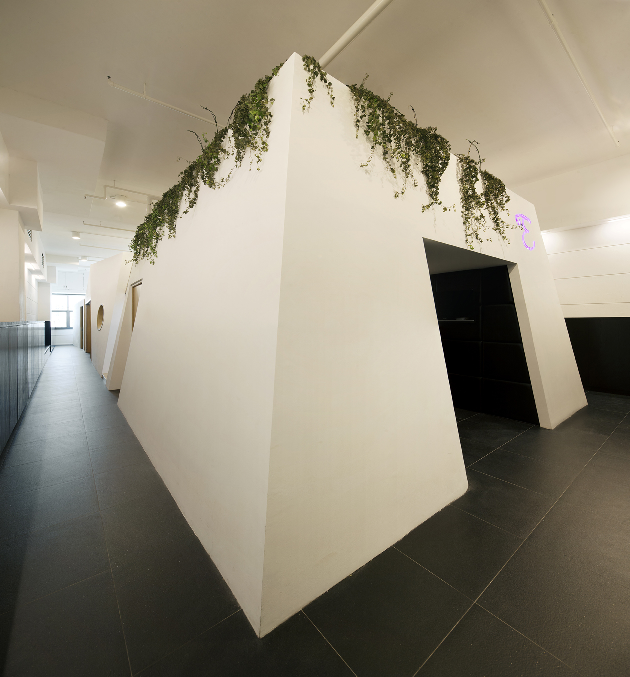
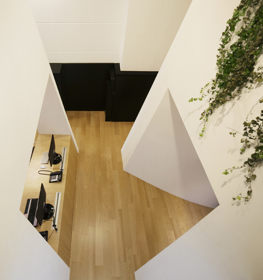
While the three office blocks stand out uniquely on their own, they are planned as an ‘urban collective’ with tapering profiles both horizontally and vertically. Besides allowing for the flow of natural daylight into the inner office areas, the different sectional profiles also add a varied spatial dimension to these pathways, a departure from your typical corridor effect. The geometric lines of each block are distinct but yet relate to the adjacent block with a subtle gradation in form. Drawing parallels with the beauty enterprise’s outreach, from their origins in the residential heartlands to their gradual presence in the central commercial area, Beauty Blocks translates these core inspirations into an interactive office environment inspired by the vibrancy of city blocks and their streets.

