9-15-Deloitte Center for the Edge
| Client | Deloitte Center for the Edge (Asia Pacific) |
| Program | Interior Refurbishment (Office) |
| Area | 32 m² |
| Status | Completed |
| Team Members | Kevin Lim |
| Ashwin Bafna | |
| Collaborators | Vitra (Furniture) |
| Affordable Abodes (Kenafcrete lamp) | |
| Roger & Sons (Meeting table) | |
| ReMARKable (Dry-erase paint) | |
| 42 Degrees Asia (Lighting) | |
| Photography | Khoo Guo Jie / Studio SKLIM |
| Year of Completion | 2020 |
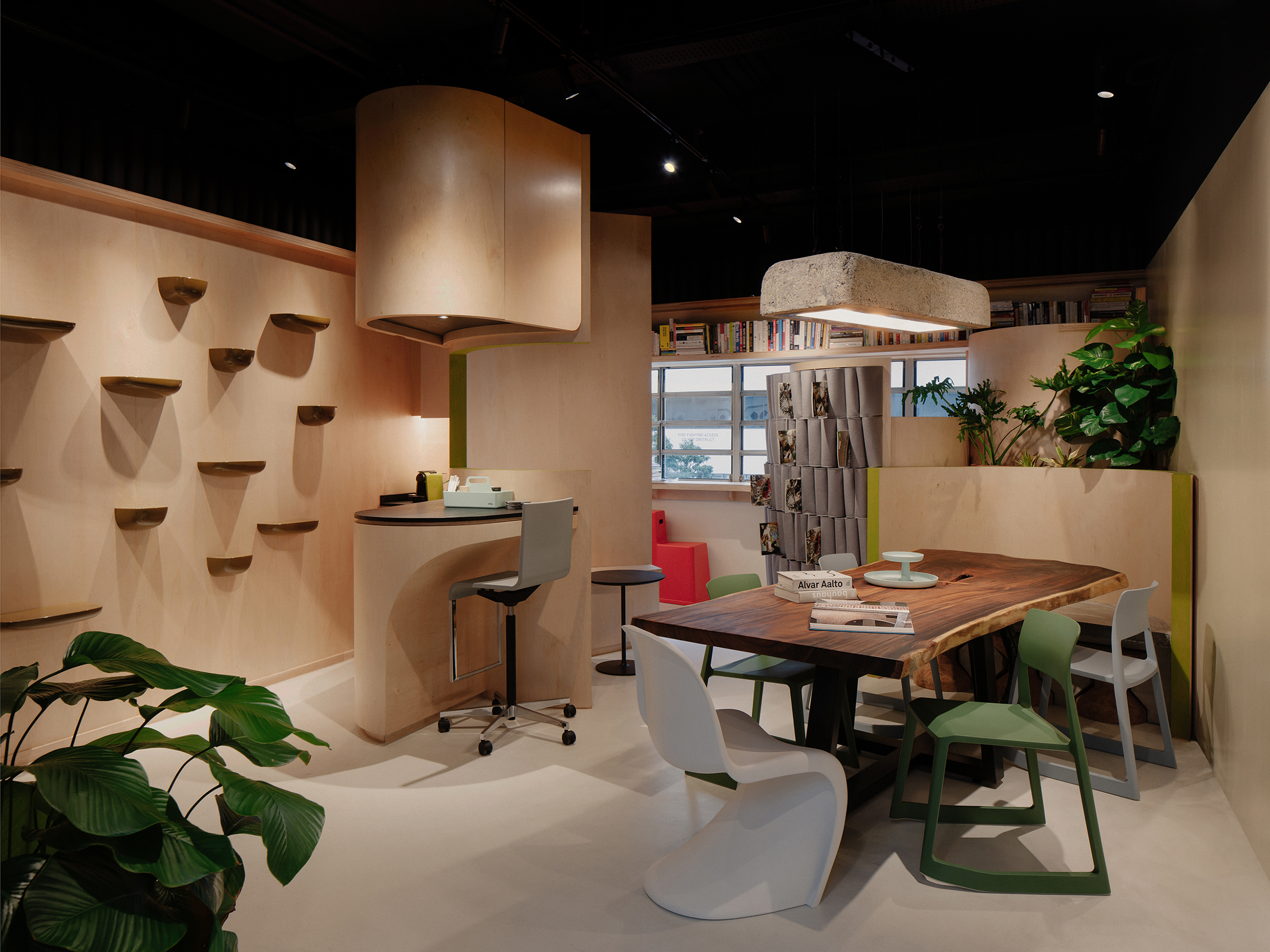
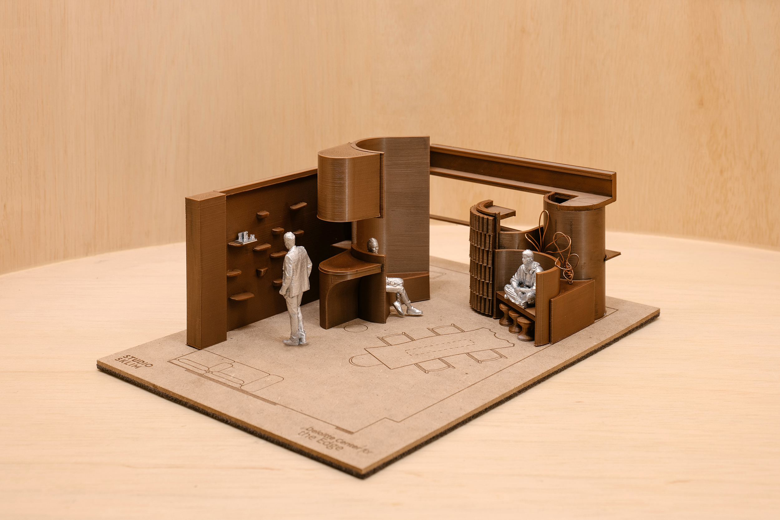
9 agile work zones wrapped by plywood shells for a compact office.
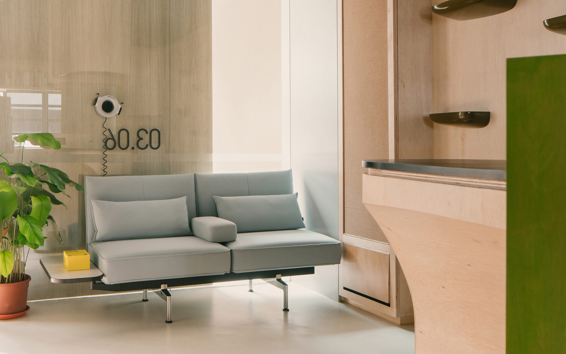
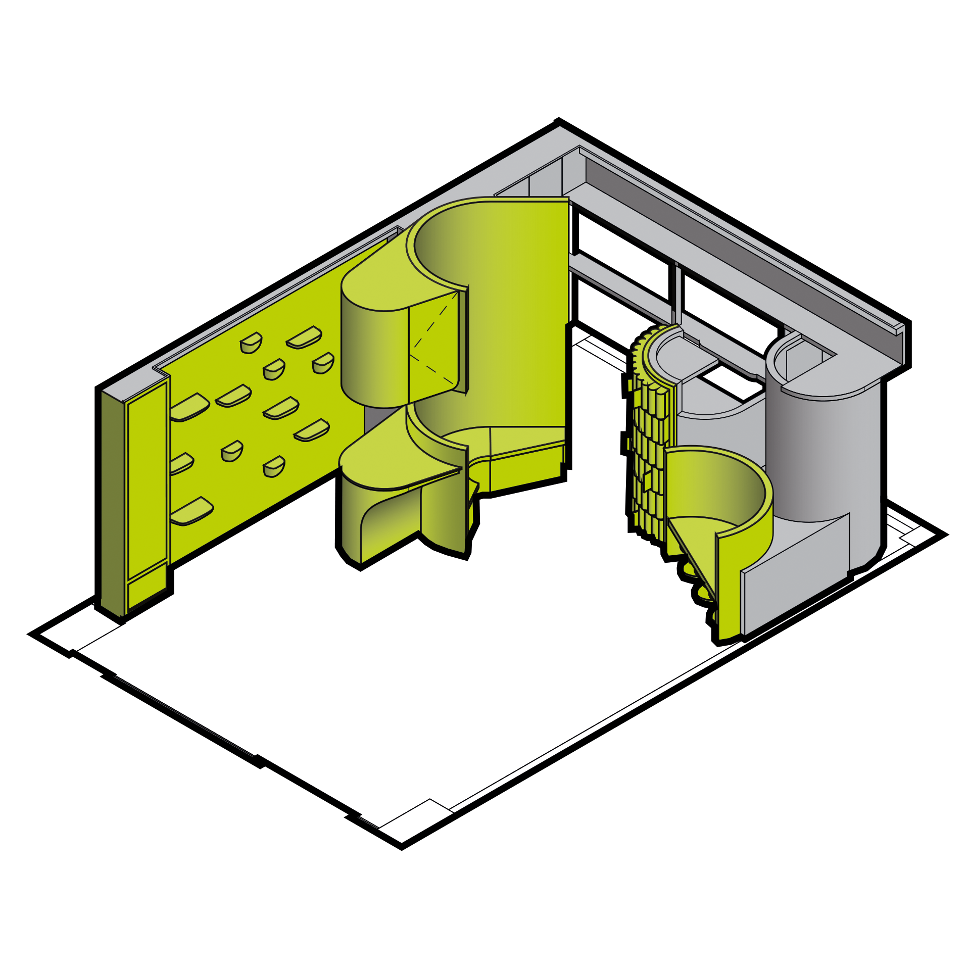
The compact office might increasingly become ubiquitous due to the increasing requirement to work from home in the post-pandemic world. For Deloitte Center for the Edge (Asia Pacific) office in Singapore, a multitude of working spaces was conceived to accommodate a myriad of working styles. The 32 m² office, located within the National Design Centre in Singapore, is designed with innate agility to transition from enclosures of individual concentration to collaborative spaces.
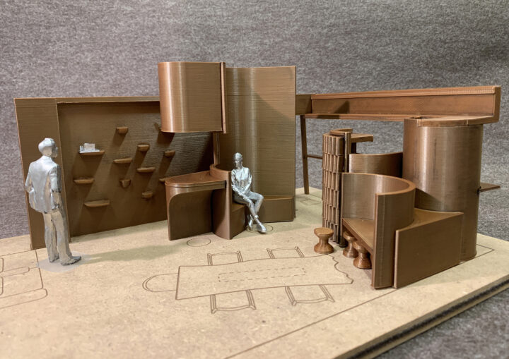
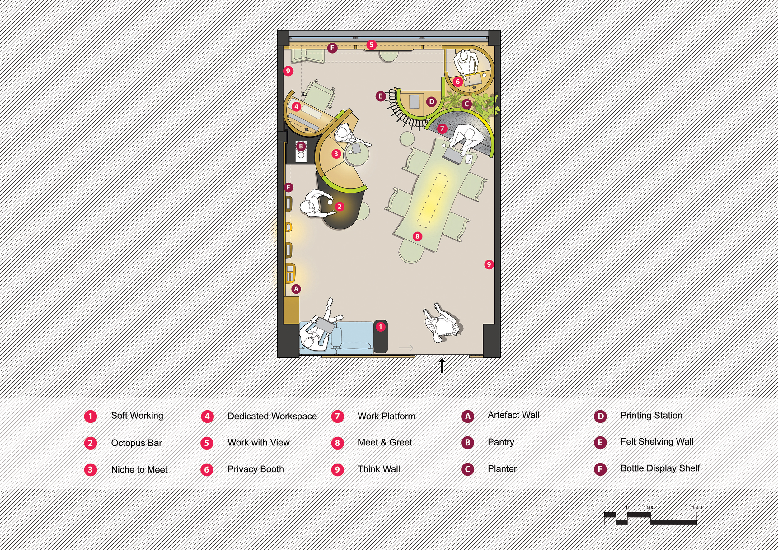
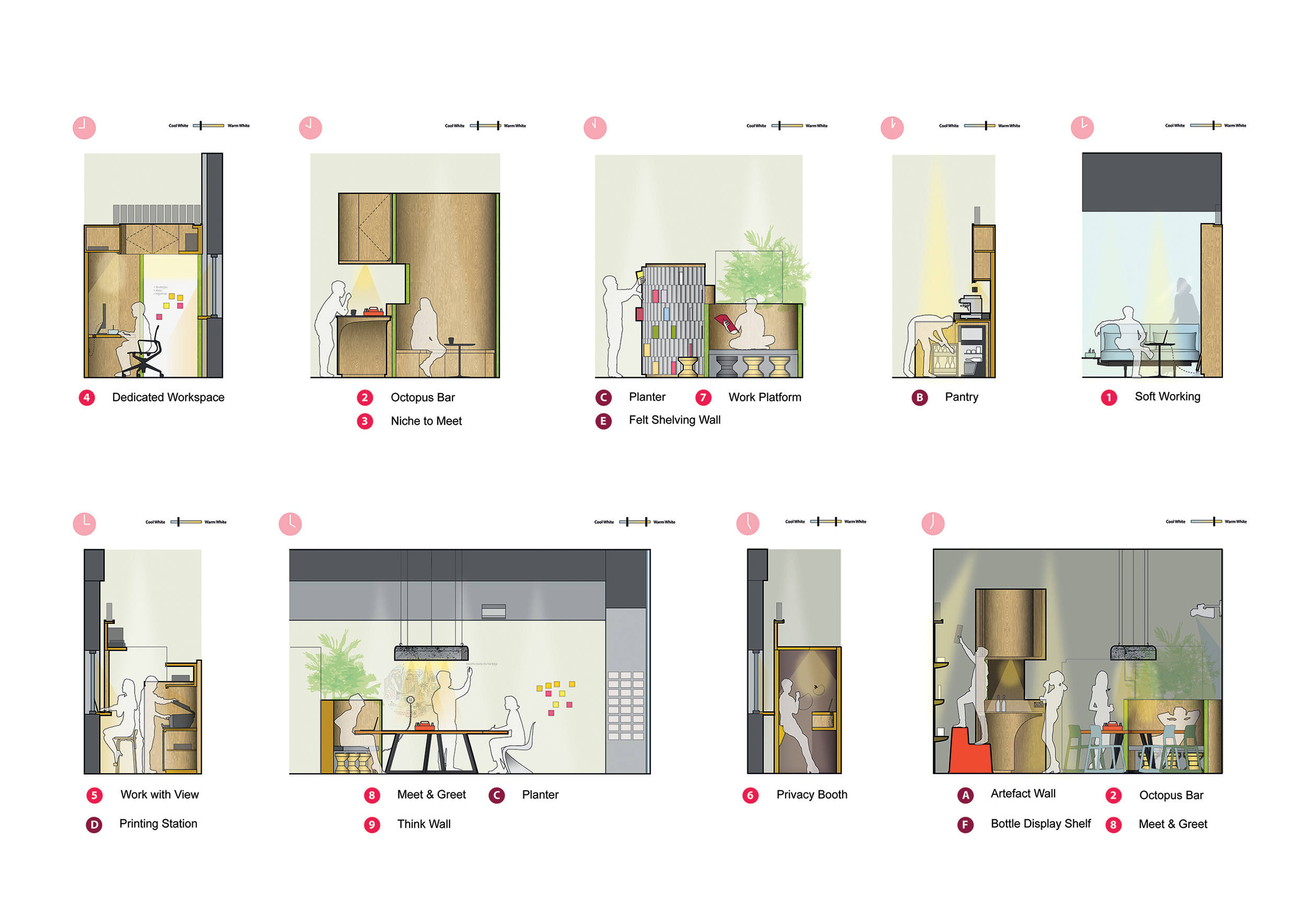
Different anthropometrical work boundaries and patterns were studied to create 9 distinct work zones:
- Soft Working – Comfortable sofa work seating
- Octopus Bar – Bar area with easy reach for work with a drink
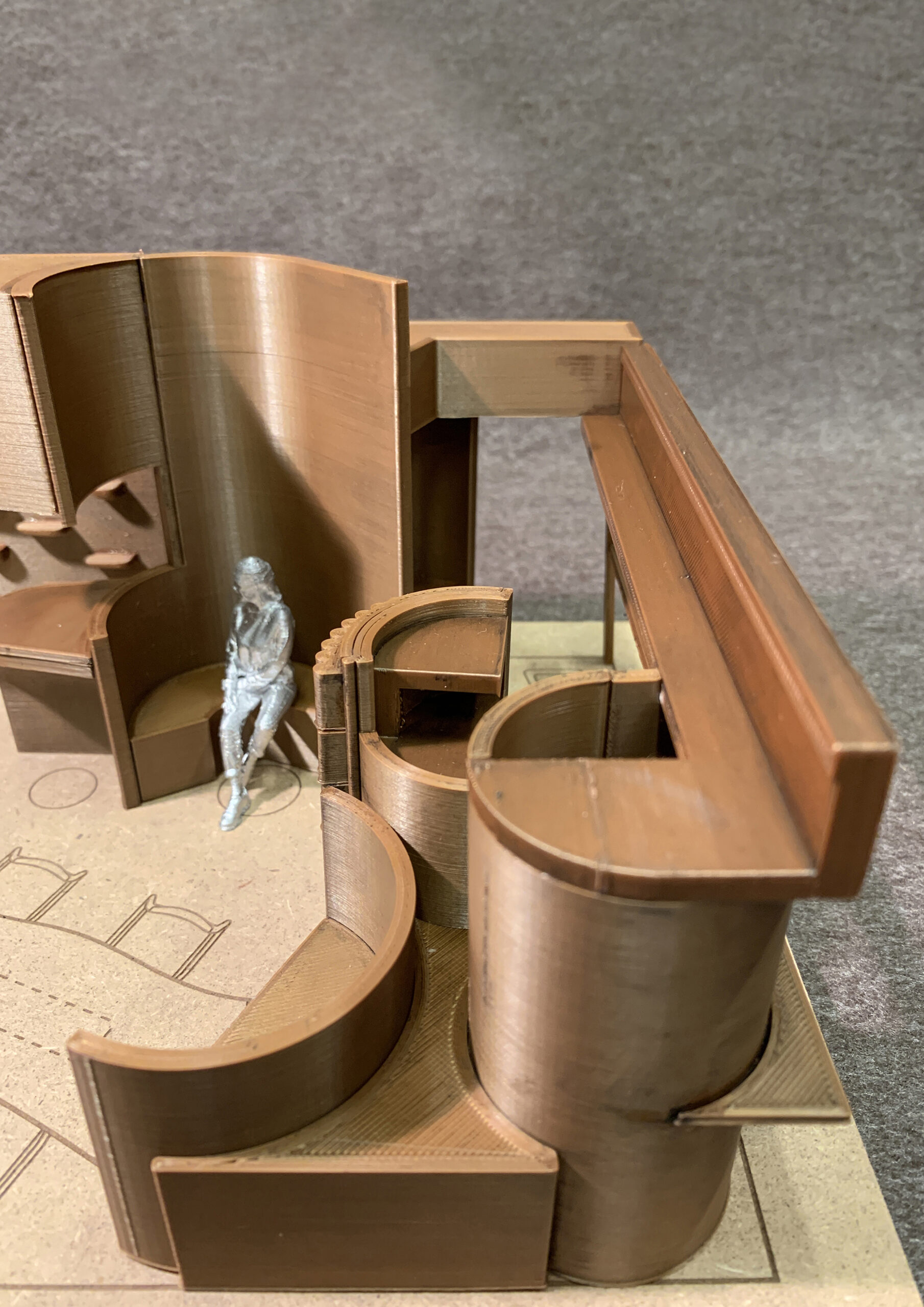
- Niche to Meet – Niche for 2-3 person discussion
- Dedicated Work Station – Single full-height work cubicle
- Work with View – Worktop with a view of the neighbourhood
- Privacy Booth – Fully felt-lined privacy booth with a standing desk and bum seat
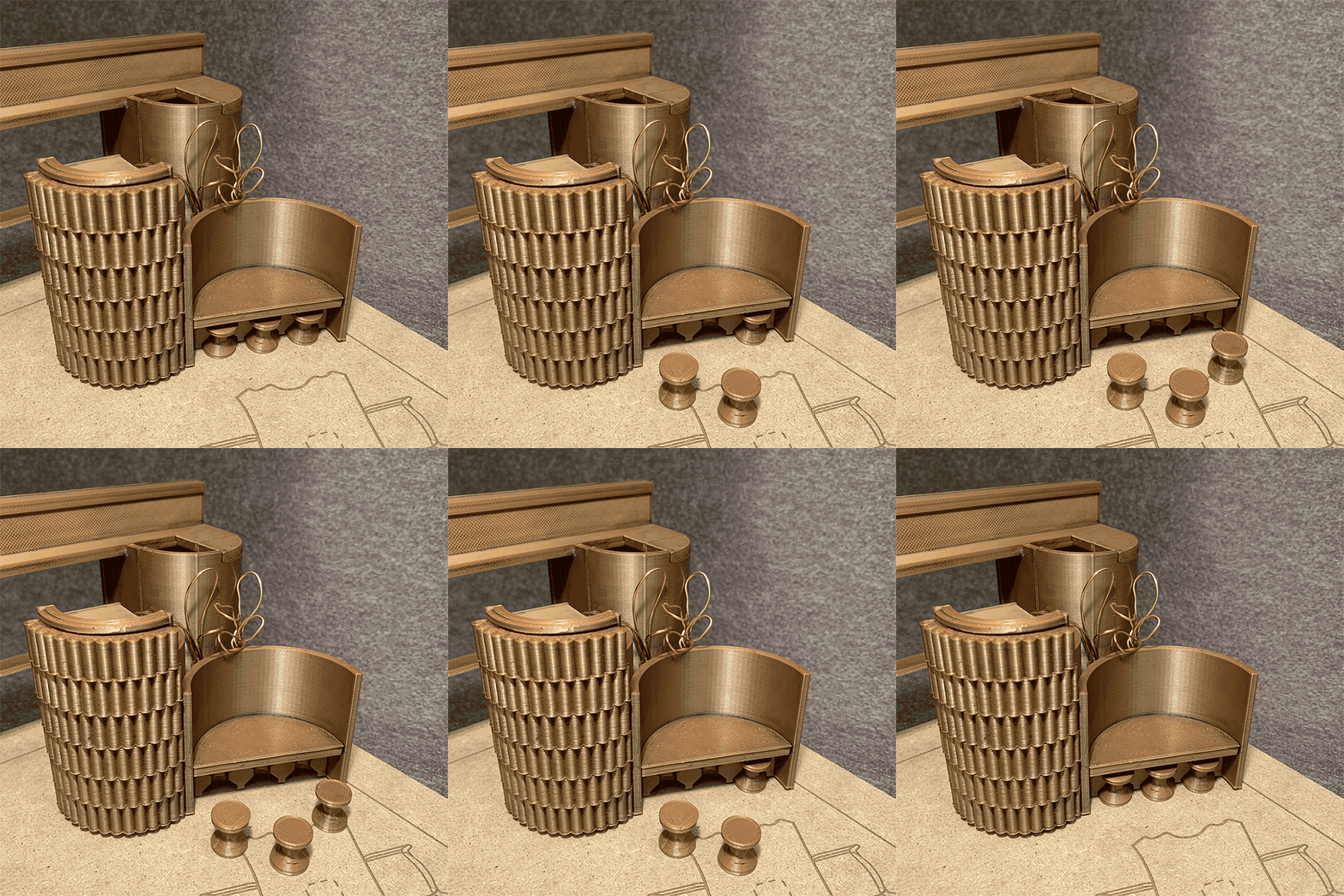
- Work Platform – Concrete platform with more relaxed sitting options and docking niches for cork stools
- Meet & Greet – Meeting table made from a local Rain Tree trunk
- Think Wall – Collaborative wall with dry-erase surface
Research and studies have shown that movement improves concentration. By having the option of different zones, movement is encouraged and a variety of works zones could be used to suit different work requirements. The choice of curved surfaces is also qualified by neurological research to be more inviting and calming, allowing for more expansive conversations. Lighting has been programmed with different colour temperatures to subtly signal variable work/relax environments from morning to the evening (e.g. cool colour temperatures gradually transitioning to warm colour temperatures). Different work zones have been programmed with different light requirements.
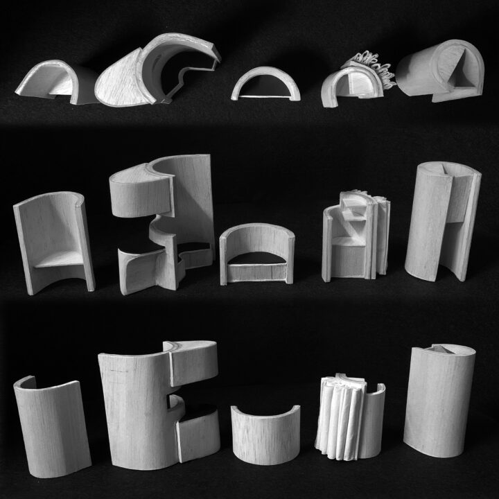
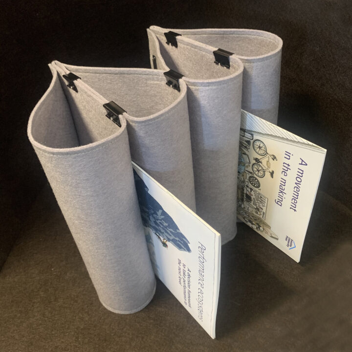
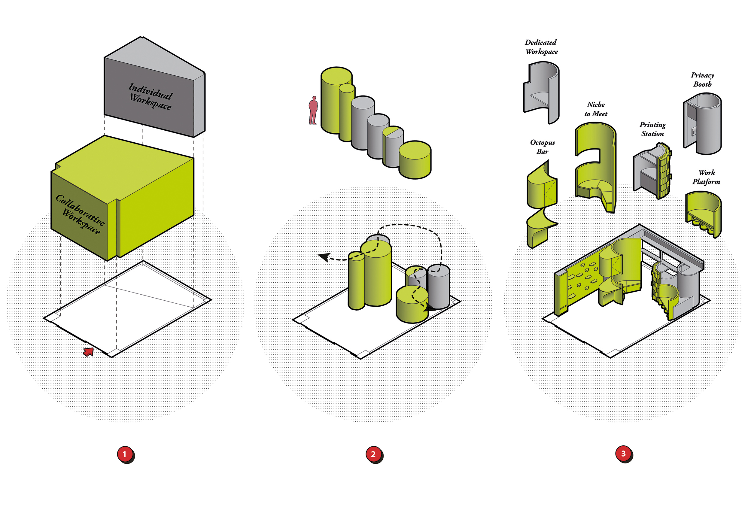
The 9 work zones are strung together like jewels on a necklace, creating a continuous ‘loop of working spaces’. The ‘loop’ is further supported with 6 ancillary spaces which include a Felt Shelving Wall for the client’s research booklets and an Artefact Wall for an interchangeable display of showcase items. The geometry of these spaces was derived by experimenting with the client’s research booklets and this inspired the creation of curvilinear plywood shells to cuddle each work zone. The plywood shells vary in height according to sightlines and orientated at different angles to create the perception of separate zones. The taller plywood shells increase the privacy for the individual and act as health barriers between adjacent zones. Further cut-outs facilitate visual interaction and shells have been staggered to emit daylight and create visual depth.
Interactivity amongst work colleagues is likely to be one of the primary incentives for a return to the office post-pandemic. The new office remains a hive for collaboration. The Think Wall is equipped with a dry erase paint surface for brainstorming sessions and discussions. The Artefact Wall functions as a modern cabinet of curiosities where curated artefacts can provoke, inspire and spark off conversations. A 100-bottle continuous display shelf provides their clients/collaborators with a dedicated area to keep their bottles in personalised containers (inspired by the Japanese bar system of ‘bottle-keep’ / botorukīpu).
The construction and selection of both carpentry and furniture have been geared towards sustainability and green practices. This was done by sourcing for eco-friendly materials/products such as vegan felt for felt shelving, local timber for a meeting table, Cork Family stools from Vitra, and a custom made pendant lamp from kenafcrete (kenaf plant fibres with lime binder). A dedicated area for potted plants also adds a biophilic touch to the office. The design and construction process has been kept honest and rudimentary to reveal the true nature of materials such as curved layered plywood and using everyday stationery items, i.e., file binders and clips were used to assemble the Felt Shelving Wall. Construction during the pandemic lockdown was a challenge with national restrictions. This was overcome by using CNC-cut templates and utilising differential cross-border lockdown situations to mitigate the fabrication process. These were transported a short distance cross border and assembled by a small team locally.
“We were looking for a ‘third space’, one that extends the current spaces at Deloitte to have a different kind of conversation with clients and teams. We wanted a space that embodied the principles of ‘provoke’, ‘inspire’, and ‘connect’ in a real working environment that also showcased the future of work and working. We were very impressed by what Studio SKLIM created that addressed the design brief exceptionally in a very small space” said Duleesha Kulasooriya, Executive Director of the Deloitte Center for the Edge who commissioned the space. “In the short time we’ve been in the space, we’ve proven that it is a great space for expansive, creative dialogues, as well as collaborative work. We look forward to expanding its use to host small gatherings as we emerge from the pandemic.”
The new office for Deloitte Center for the Edge challenges the new normal of the work environment with a wide range of work zones in a very modest footprint.
